Understanding Requirements
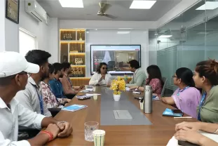
The initial stage of our responsive web designing process involves gathering a thorough understanding of the client’s needs and expectations. We conduct in-depth discussions with our clients to gain insights into their target audience, business objectives, and design preferences. This enables us to tailor the design and functionality to suit specific goals. By identifying the client’s brand identity, desired user experience, and functionality requirements, we create a strategy that aligns with their vision. We also analyze competitors and market trends to ensure that the website stands out. With this comprehensive understanding, we set the foundation for a seamless design process, ensuring that all requirements are met at each stage of development.
Creating Wireframes
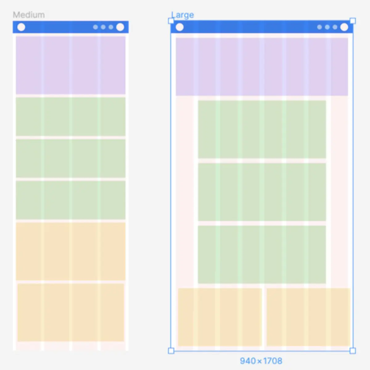
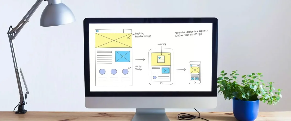
Once the requirements are clear, we proceed with creating wireframes that serve as the foundation for the website’s design. These wireframes are essentially blueprints of the website, focusing on layout, navigation, and structure without the distraction of colors or fonts. By focusing on the placement of key elements like the header, footer, content areas, and call-to-action buttons, wireframes allow us to prioritize user experience and functionality. This stage also provides an opportunity for early feedback from the client, ensuring alignment before moving forward. With approved wireframes, we have a solid base to begin the design process, ensuring that the overall structure is functional and easy to navigate across all devices.
Crafting Visual Design
Once the wireframes are finalized, we move on to creating the visual design of the website. This stage is where creativity meets functionality. We incorporate the brand’s color scheme, typography, and imagery to create a visually appealing design that aligns with the company’s identity. The design is not just aesthetically pleasing but also functional, ensuring that elements like buttons, forms, and navigation menus are intuitive. We place significant emphasis on creating a design that works across various devices, ensuring that the layout looks polished and cohesive on everything from smartphones to desktop screens. After completing the design, we present it to the client for feedback and make adjustments as necessary.
Implementing Responsive Layout
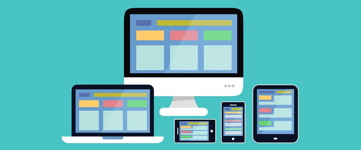
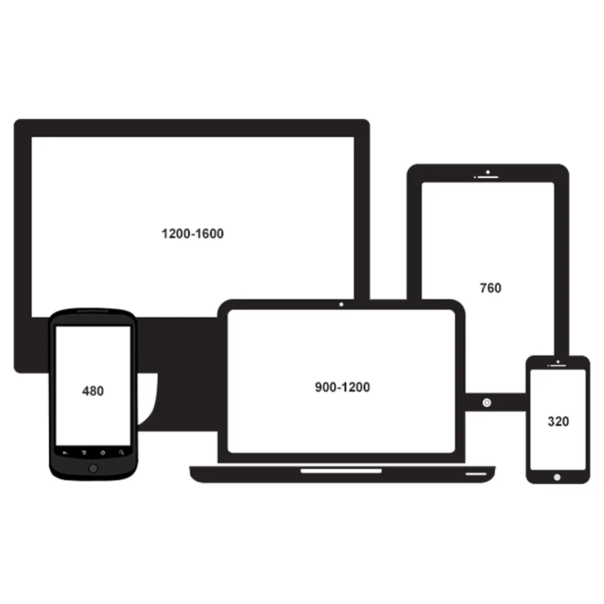
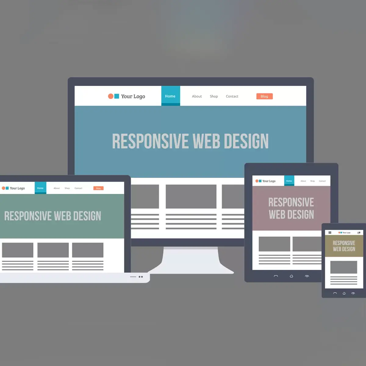
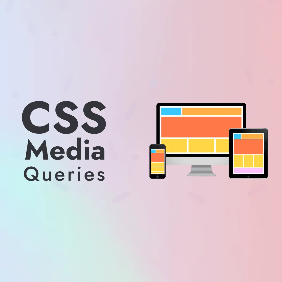
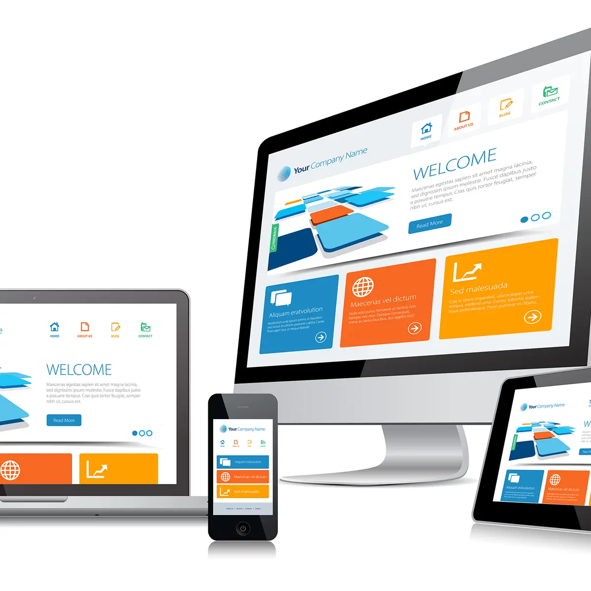
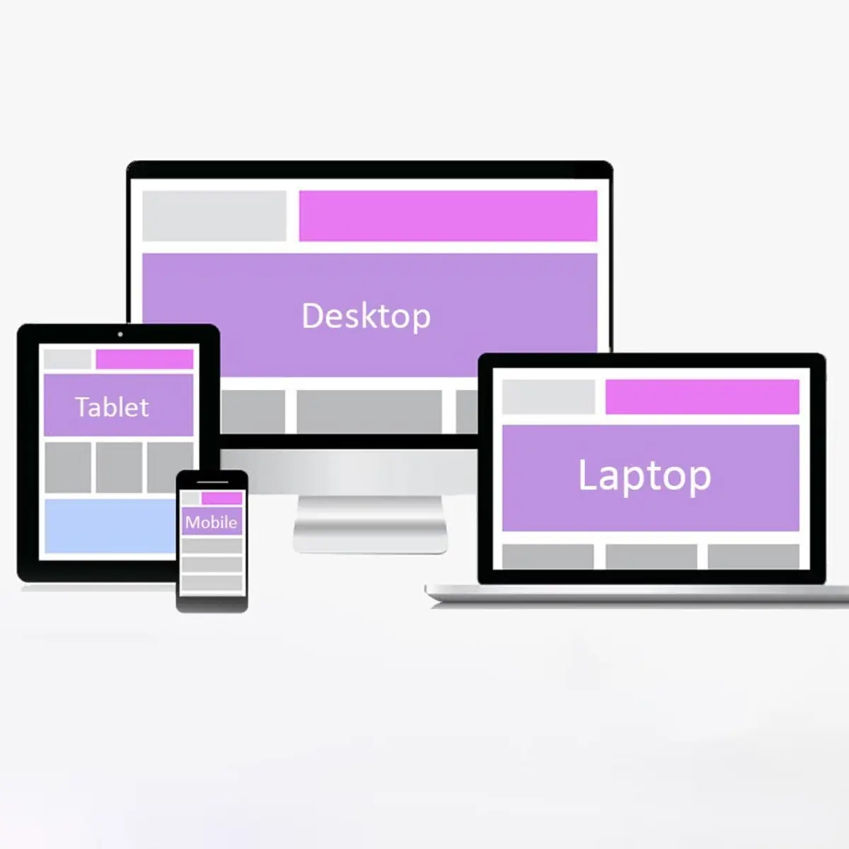
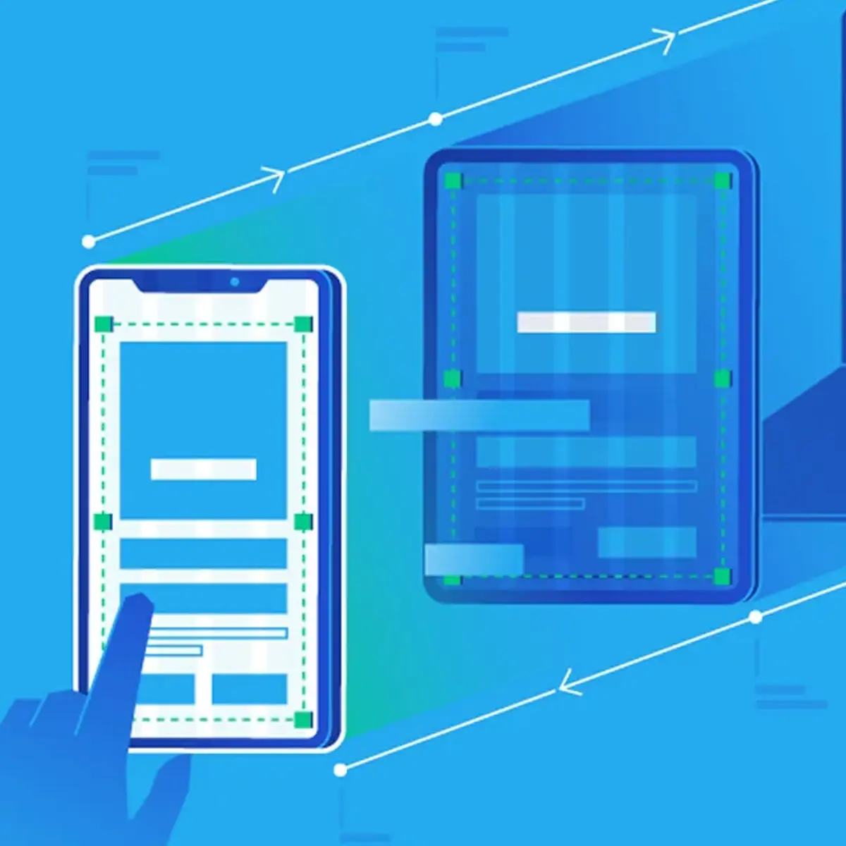
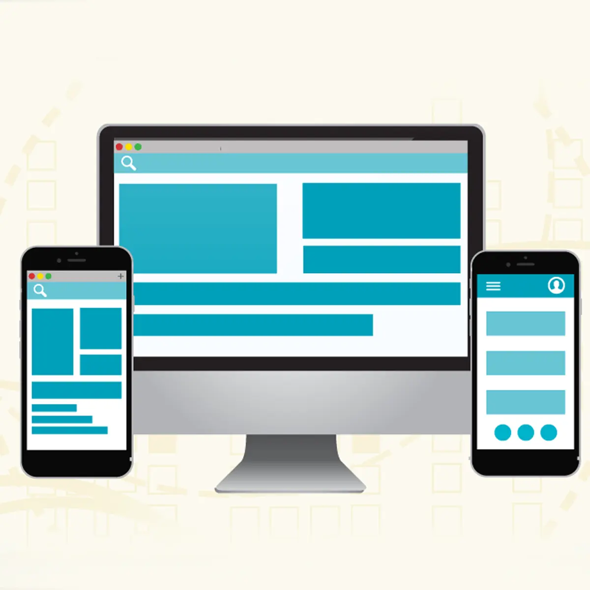
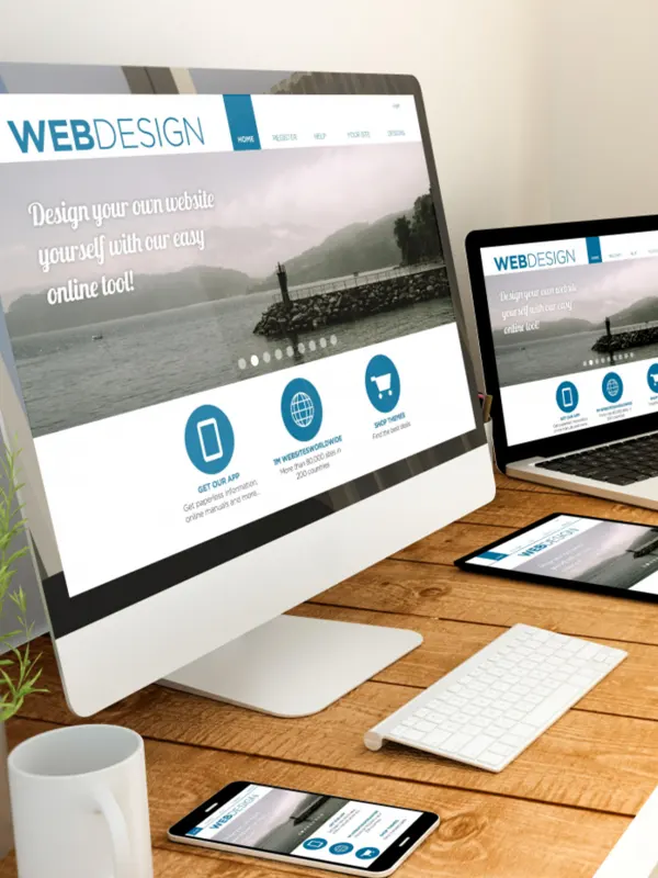
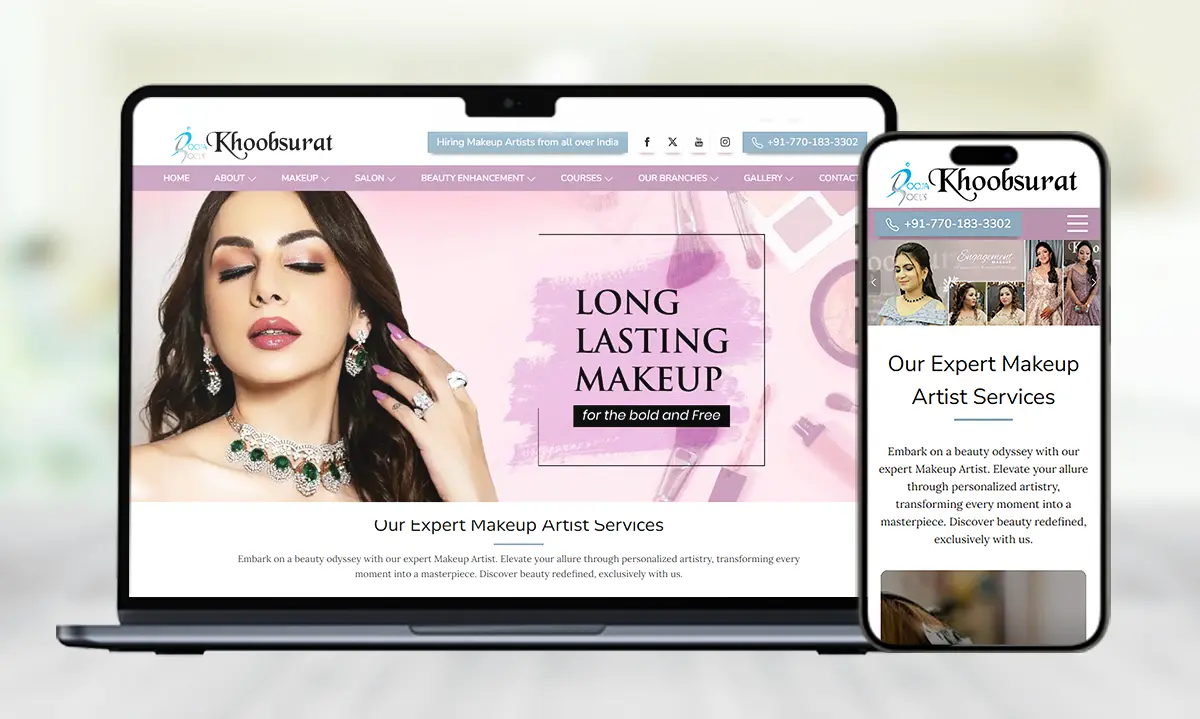
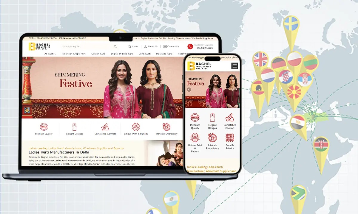
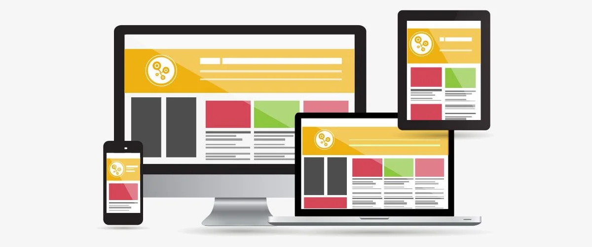
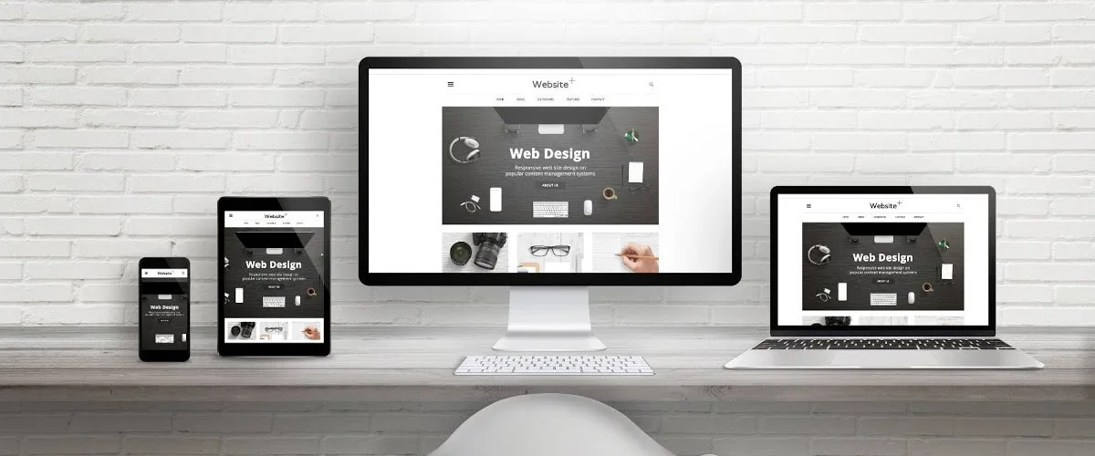
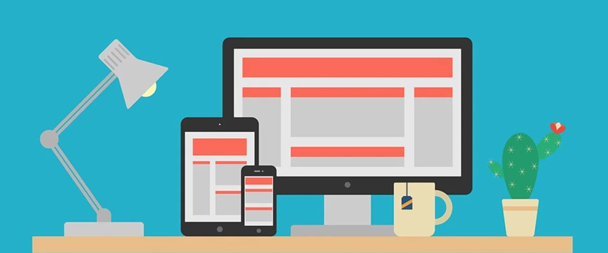
After finalizing the visual design, we move forward by implementing a responsive layout that ensures optimal viewing and usability across all devices. Using flexible grids, media queries, and fluid images, we adjust the layout so it adapts seamlessly to different screen sizes, whether it’s a mobile phone, tablet, or desktop. This adaptability is critical in ensuring that users have a positive experience regardless of the device they use. We pay attention to details like touch interactions, font sizes, and navigation, making sure the website remains user-friendly on any platform. The goal is to deliver a responsive website that not only looks great but functions perfectly across various devices and screen resolutions.
Optimizing User Experience (UX)
Creating an exceptional user experience (UX) is a top priority throughout the design process. Our focus is on making the website intuitive, easy to navigate, and engaging. We ensure that visitors can find what they need quickly by using clear, easy-to-read typography and a logical layout. User-centric design principles are implemented to enhance usability, and we carefully place call-to-action buttons, ensuring they are prominent and encourage desired actions. Through usability testing, we identify potential pain points and make adjustments to improve the overall experience. This phase involves refining interactive elements like forms, buttons, and sliders to make them both functional and enjoyable to use, ultimately providing a seamless experience for every visitor.
Testing Across Devices
Once the design is implemented, we begin extensive testing across a wide range of devices and browsers to ensure the website is fully responsive and compatible. Testing is conducted on smartphones, tablets, and desktops to verify that all features, from navigation menus to interactive elements, work flawlessly. We also ensure that the website looks consistent across various browsers, such as Chrome, Firefox, and Safari. This step is crucial to identifying any discrepancies in layout, functionality, or performance. By addressing issues early on, we can deliver a website that offers a seamless experience to users, regardless of the device or browser they use. The testing phase guarantees that the website functions flawlessly for all users.
Code Optimization
To ensure that the website runs smoothly and efficiently, we focus on optimizing the code. Clean, well-structured code is essential for fast loading times, better search engine rankings, and improved user experience. We remove unnecessary code, minify files, and compress images to reduce page load times. Techniques like lazy loading for images and scripts are implemented to further enhance performance. The optimized code also ensures that the website is lightweight, which directly impacts its speed and functionality. By optimizing the website's code, we not only improve its performance but also contribute to better user satisfaction and higher engagement rates, ensuring the site loads quickly on all devices.
SEO Integration
Integrating SEO best practices during the web design process is crucial to ensuring that the website is visible to search engines and ranks well in search results. We incorporate SEO-friendly elements such as properly structured headings, optimized meta descriptions, and image alt texts. By ensuring the use of clean code and mobile-friendly design, we help improve the site's search engine performance. We also focus on making the website’s content accessible to both users and search engines, ensuring fast page load times and easy navigation. Through this integration of SEO, we make sure the website attracts organic traffic, which is vital for its long-term success.
Continuous Feedback & Revisions
Throughout the design process, we place significant importance on collaboration and client feedback. After each major milestone, we present the design to our clients for review, ensuring their vision is accurately captured. This iterative process allows us to make necessary adjustments based on feedback, ensuring the final product aligns with their expectations. We remain flexible and open to revisions, constantly refining the design to meet the client’s requirements. This ongoing feedback loop helps us create a user-friendly, visually stunning website that reflects the client’s brand identity and goals. With each revision, the website becomes closer to the ideal user experience we aim to deliver.
Final Launch & Support
After thorough testing and client approval, we move forward with launching the website. This involves deploying the site to a live server and ensuring that all functionalities work smoothly. Once the site is live, we provide ongoing support to address any issues, monitor performance, and make any necessary updates. We also offer training to ensure that clients can manage their website’s content independently. The launch is followed by a period of monitoring, ensuring that everything runs as expected. Our commitment doesn’t end with the launch—continuous support and maintenance are offered to keep the site up-to-date, secure, and optimized for performance over time.








.webp)


