Concept & Planning

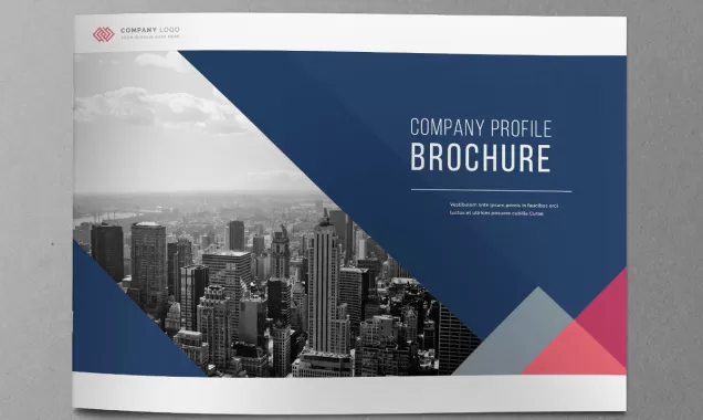
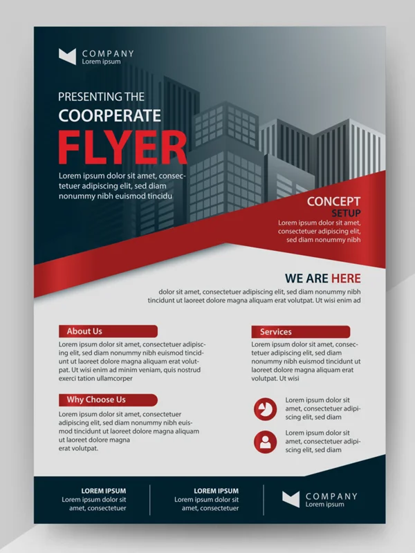
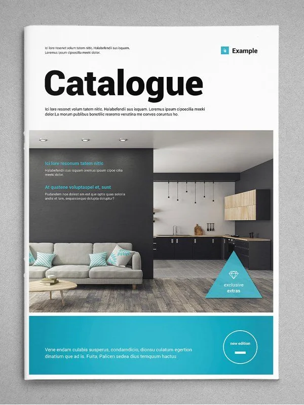
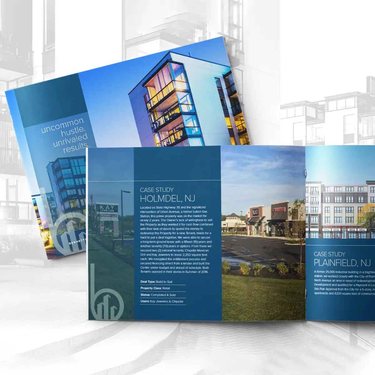
The foundation of a great PDF brochure lies in careful planning. This phase involves understanding your business objectives, target audience, and key messages. We conduct research to gather insights and determine the best approach for your brochure’s design and content. A clear vision is established, defining the purpose—whether it's for marketing, product promotion, corporate branding, or informational use. Our team collaborates to map out the structure, outline the content, and establish a creative direction that aligns with your brand identity. This planning ensures a well-organized and goal-driven design. We also decide on the brochure’s format—whether it will be a single-page flyer, multi-page catalog, or interactive PDF. Setting a strong foundation at this stage helps streamline the design process and ensures that the final product effectively communicates your message while maintaining visual appeal and professionalism. Strategic planning leads to a compelling, high-quality brochure.
Content Structuring

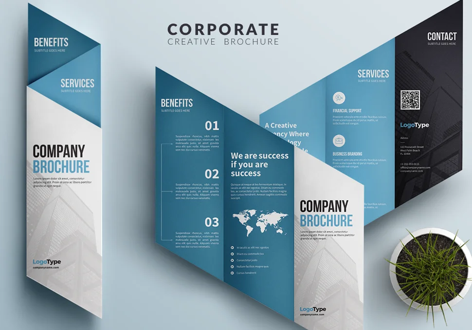
A well-structured brochure makes it easy for readers to grasp information quickly. We begin by organizing the content in a logical flow, ensuring each section smoothly transitions into the next. Headings, subheadings, and bullet points are used strategically to enhance readability. Important sections like the company overview, product details, service highlights, and contact information are carefully placed for maximum impact. The goal is to present key messages concisely while keeping the design clutter-free. Each piece of content is refined to be clear, engaging, and aligned with the brochure’s purpose. Call-to-action elements are also incorporated to encourage the desired response from readers. This step ensures that the brochure not only looks visually appealing but also effectively conveys information in an easy-to-digest manner. A structured layout makes a significant difference in audience engagement and retention, ensuring the content is both informative and compelling.
Visual Theme Selection
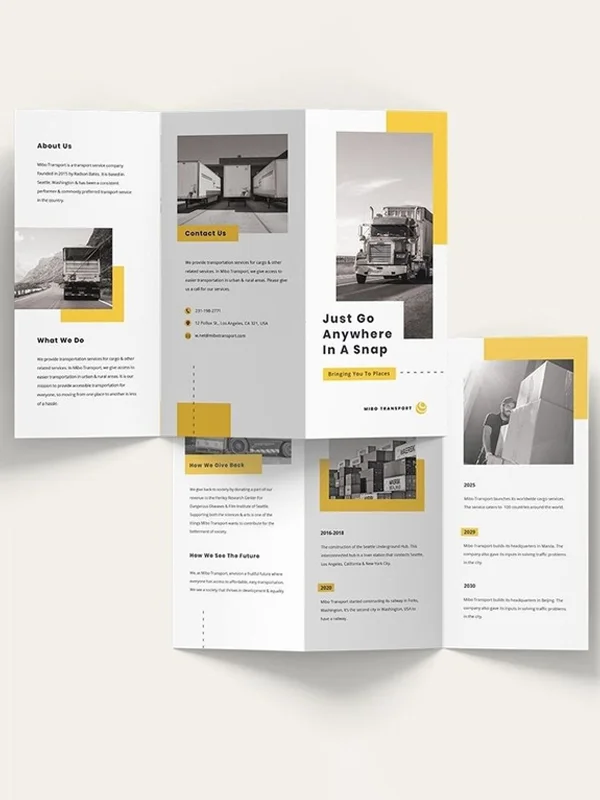
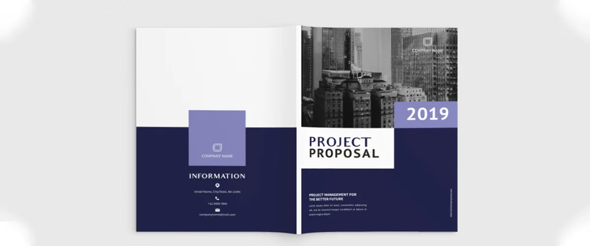
The visual theme of a PDF brochure sets the overall tone and aesthetic appeal. We begin by selecting a color palette that aligns with your brand identity, ensuring consistency across all marketing materials. The choice of graphics, icons, and background elements is carefully curated to maintain harmony and balance. A professional and visually engaging theme enhances the readability of the content while making a lasting impression on the audience. Depending on the brand’s personality, we may choose a minimalistic, elegant, modern, or vibrant theme. Every design element is chosen to create a cohesive look that reflects the brand’s vision. Consistency in design is key, and we ensure that fonts, image styles, and graphic elements complement each other. A well-thought-out visual theme not only makes the brochure more appealing but also strengthens brand recognition, ensuring that the document is both attractive and effective.
Layout & Formatting
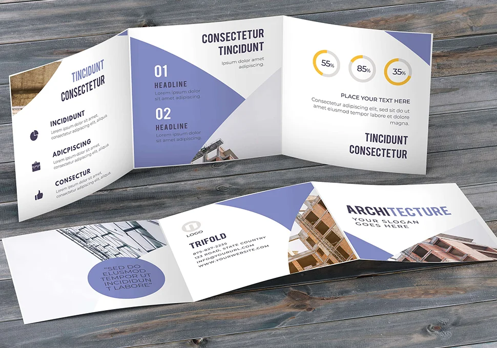
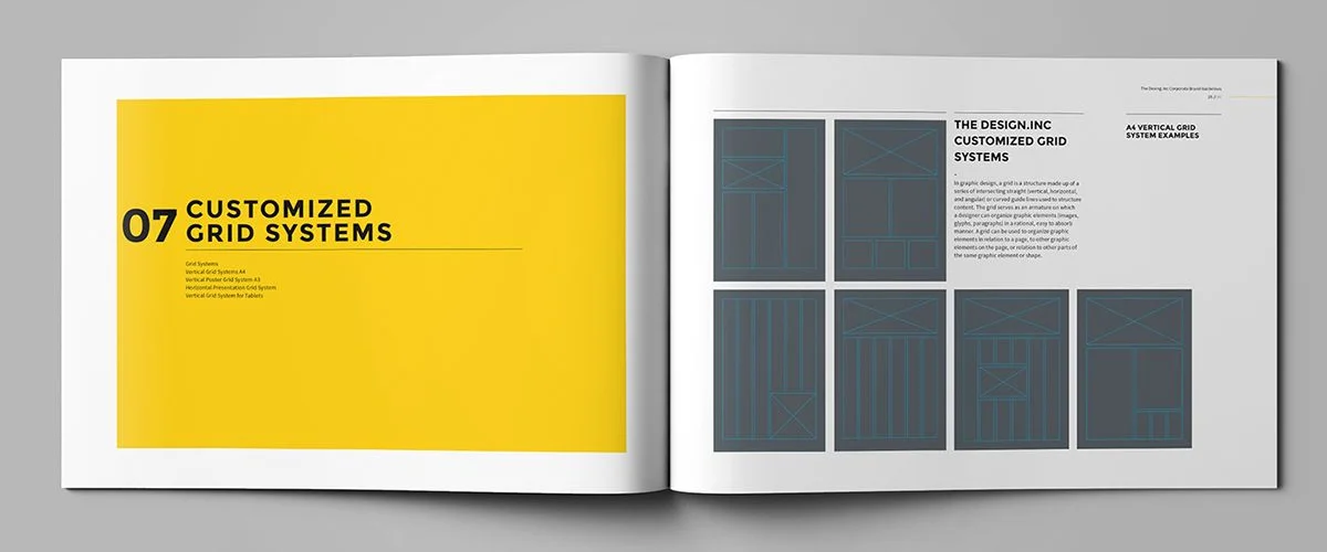
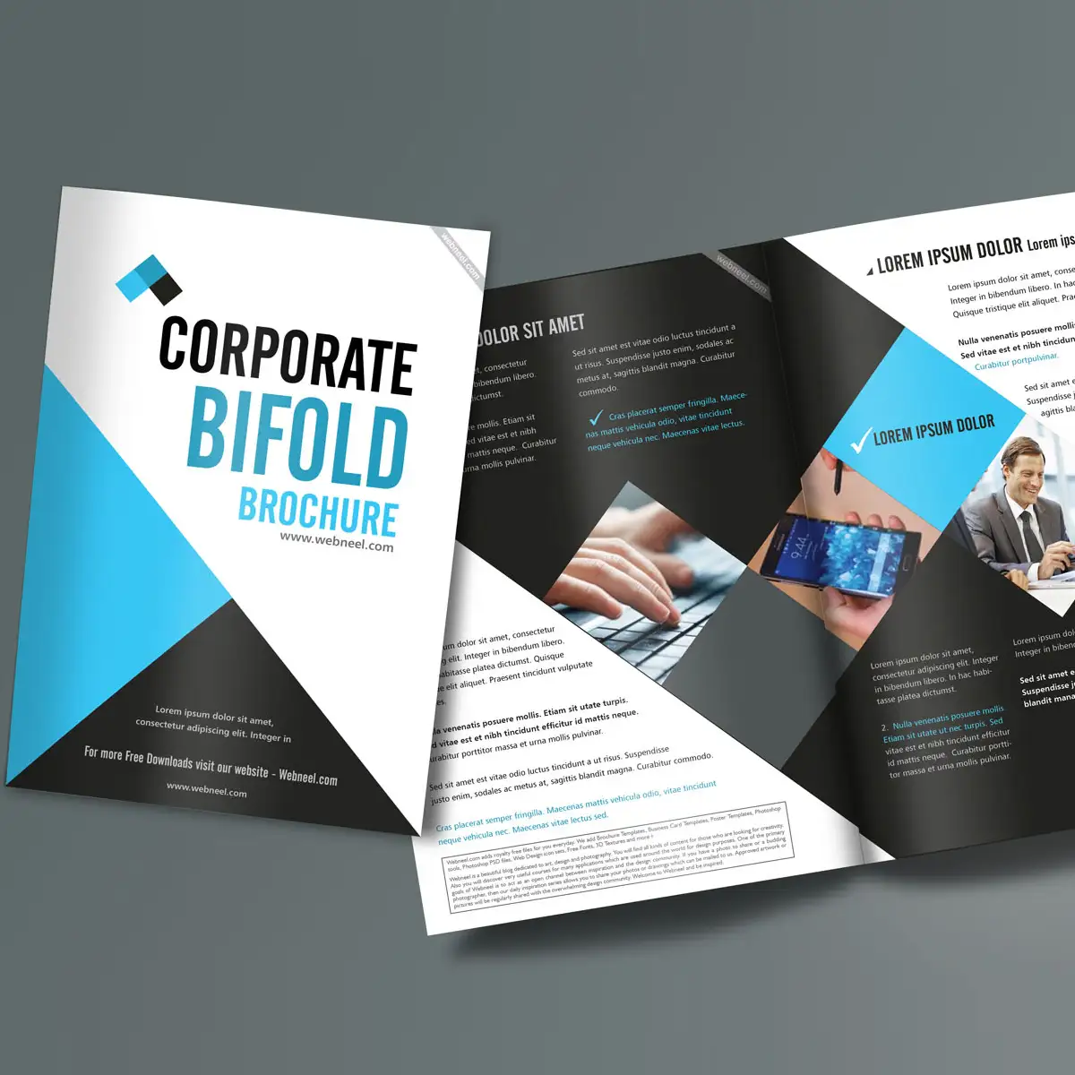
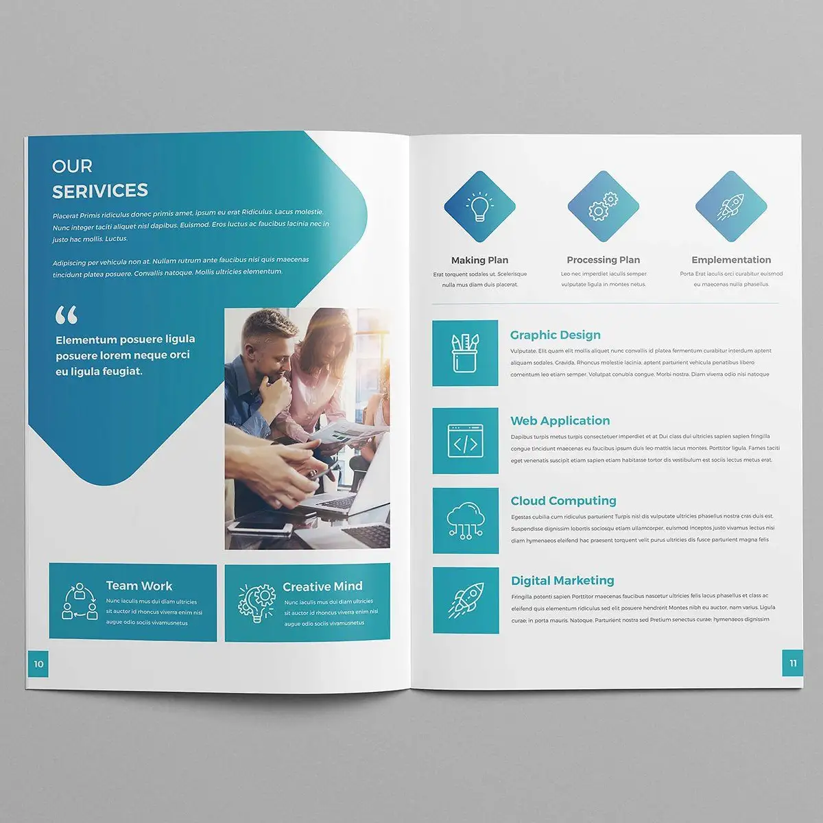
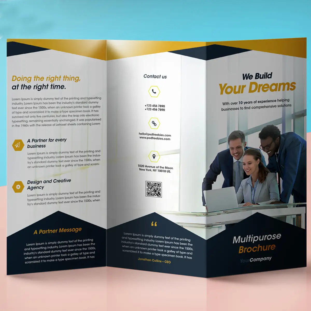
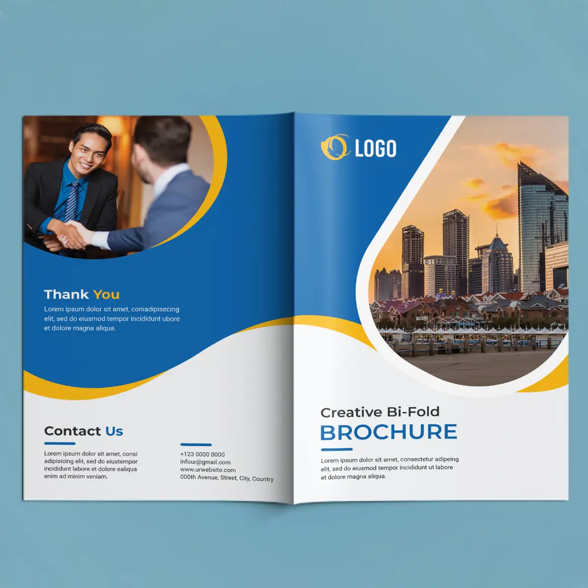
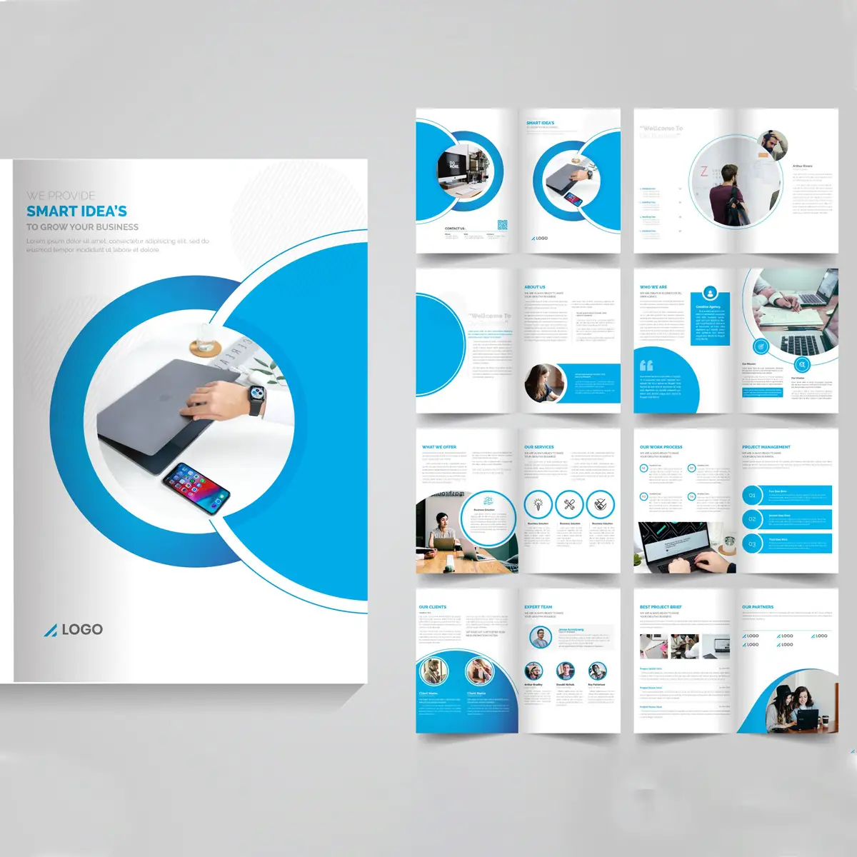
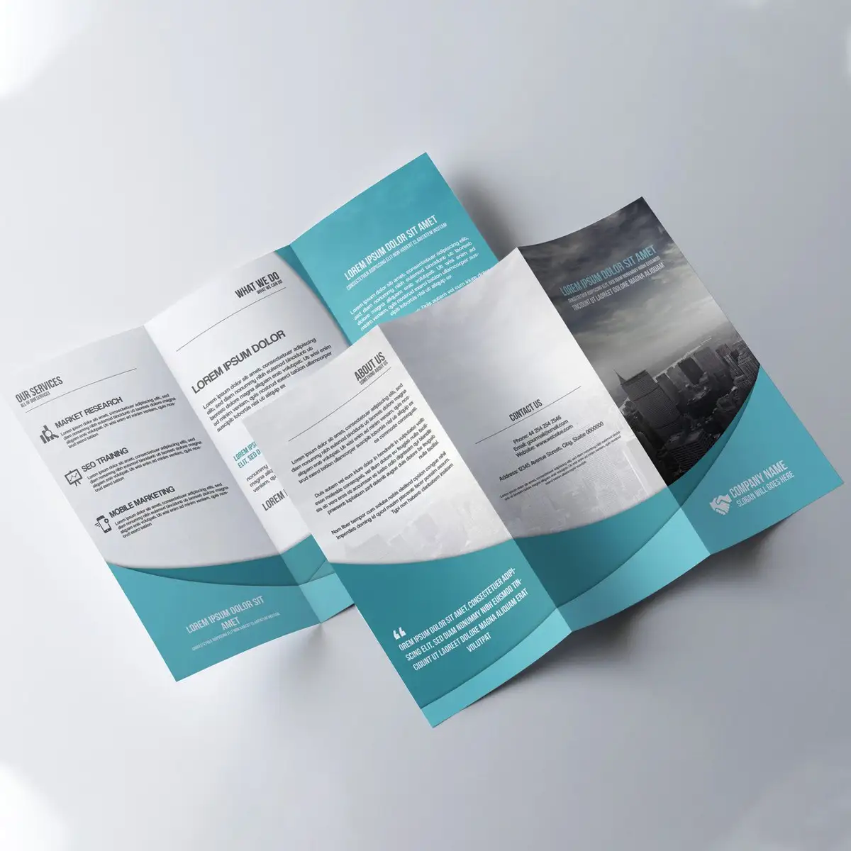
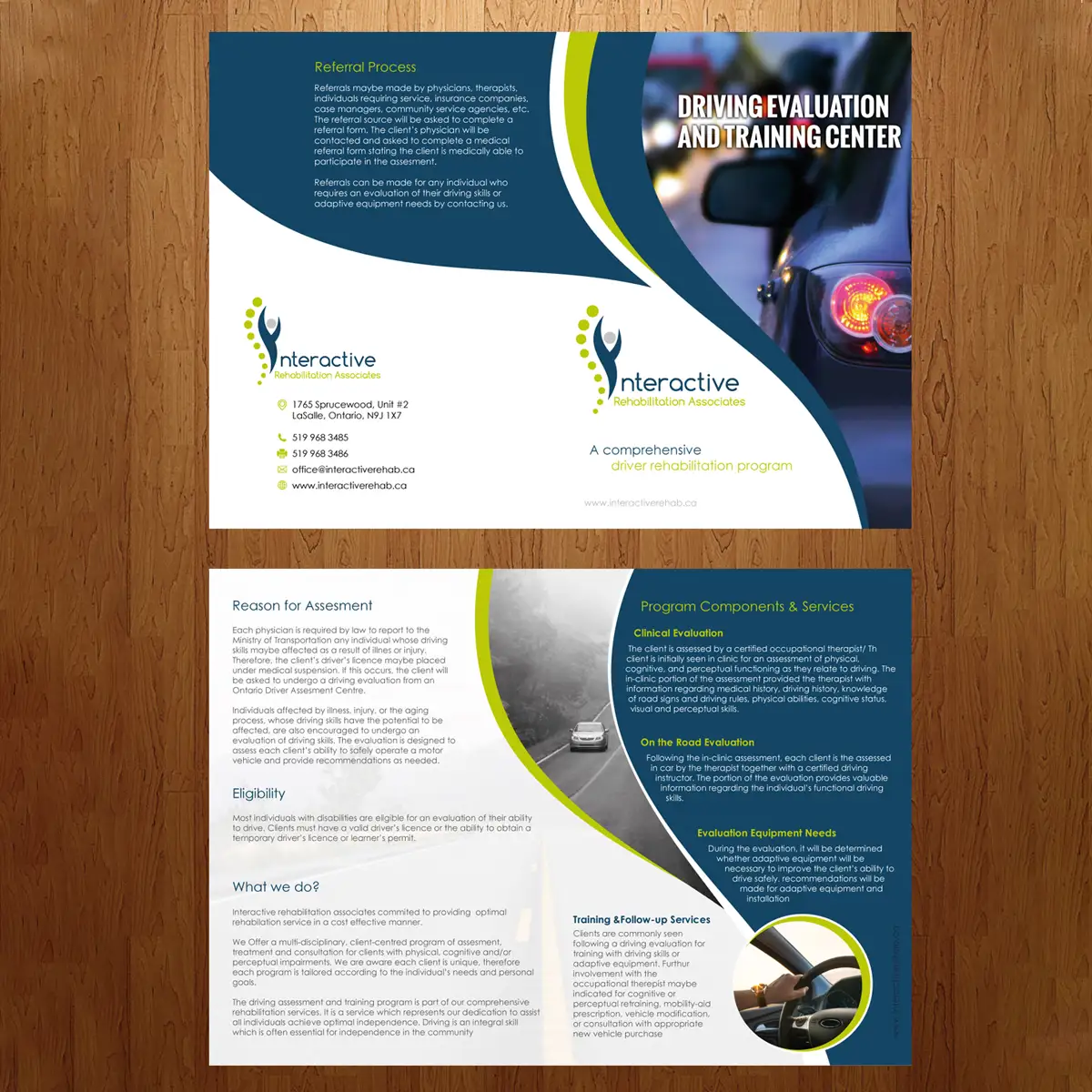
A well-structured layout ensures that the PDF brochure is both visually appealing and easy to navigate. We use a grid-based approach to balance text, images, and white space, ensuring a clean and organized presentation. The placement of elements is carefully planned to guide the reader’s eye naturally from one section to another. Consistency in spacing, alignment, and text formatting helps create a professional look. The use of margins and padding ensures that content is not overcrowded, making it easier to digest. Interactive elements, such as clickable buttons and hyperlinks, may also be added for digital brochures. The goal is to create an intuitive layout that enhances the reading experience while maintaining aesthetic appeal. A well-formatted brochure reflects professionalism, increases engagement, and improves readability, ensuring that the content is delivered in a structured and visually compelling manner.
Typography & Readability
Typography plays a crucial role in the effectiveness of a PDF brochure. We carefully select fonts that reflect the brand’s identity while ensuring readability across different devices. A combination of bold headlines, subheadings, and body text is used to create a clear hierarchy, making the content easier to scan. We avoid overly decorative fonts that might compromise legibility and instead focus on professional, clean typefaces. Proper line spacing, paragraph alignment, and contrast between text and background further improve readability. Additionally, we ensure font sizes are optimized for both print and digital viewing. By maintaining consistency in typography throughout the brochure, we enhance its professionalism and usability. Good typography ensures that the reader can effortlessly absorb the information without distraction, ultimately improving engagement and message retention.
Incorporating Brand Elements
To maintain brand consistency, we seamlessly integrate essential brand elements into the brochure. This includes the company’s logo, brand colors, typography, and visual style. These elements help reinforce brand identity and establish trust with the audience. A well-branded brochure creates a strong recall value, making it easier for potential clients to recognize your business. In addition to the standard brand elements, we incorporate custom graphics, icons, and backgrounds that complement your brand’s look and feel. Even the tone of the content is aligned with your brand voice, ensuring a cohesive presentation. The placement of branding elements is strategic, ensuring they enhance rather than overpower the design. By consistently incorporating brand elements, we create a brochure that not only looks professional but also strengthens the overall brand presence and credibility.
Image & Graphics Integration
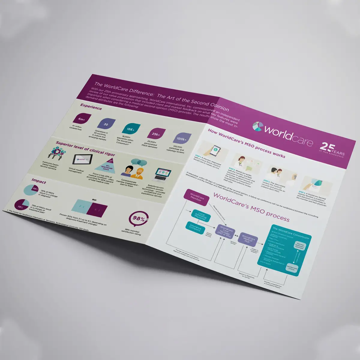
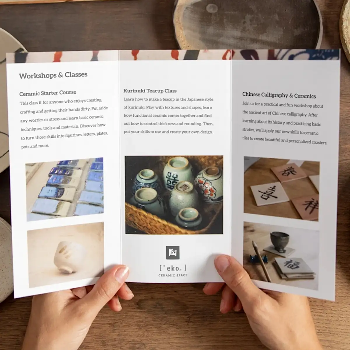
High-quality visuals are essential for making a brochure engaging and appealing. We select relevant images, illustrations, and icons that complement the content and enhance storytelling. Using high-resolution images ensures clarity and a polished appearance. Infographics, charts, and visual representations are included to break down complex information and make data more digestible. Proper image placement is crucial to maintaining a clean and balanced layout. We avoid excessive use of visuals that may distract from the main message. Additionally, we ensure that graphics are aligned with the brand’s color scheme and style, creating a unified look. By integrating the right mix of visuals and text, we enhance engagement and ensure the brochure captures and holds the audience’s attention effectively.
Review & Refinement
Before finalizing the PDF brochure, we conduct a thorough review and refinement process. This involves checking for any inconsistencies in content, layout, and design elements. Spelling and grammar errors are corrected, ensuring professionalism. We also test readability and visual appeal across different screen sizes and resolutions to ensure a seamless user experience. Feedback from clients or team members is incorporated to make necessary adjustments. Every detail, from font size to spacing, is fine-tuned to perfection. The refinement stage ensures that the final product is error-free and visually polished. By investing time in meticulous reviews, we ensure the highest quality standards and create a brochure that is both professional and impactful.
Final Touches & Proofing
Once the main design is complete, we perform a final round of proofing to ensure perfection. This step includes color correction, alignment adjustments, and checking all hyperlinks in digital brochures. We optimize the file size to maintain high resolution while ensuring fast loading speeds for online distribution. Interactive elements, such as clickable links and embedded media, are tested for functionality. Additionally, we verify that the design is print-ready, meeting the required specifications for professional printing. The final touches add polish to the brochure, making it ready for both digital and print use. Ensuring everything is flawless at this stage guarantees a smooth delivery process, avoiding last-minute issues.
Export & Delivery
The last step in the PDF brochure designing process is exporting and delivering the final product in the required formats. We provide high-resolution PDF files optimized for both digital sharing and professional printing. If needed, we also offer compressed versions for easy email distribution. The final brochure is tested on multiple devices to ensure compatibility. We also provide additional formats like interactive PDFs with clickable links or flipbook-style presentations, depending on client requirements. A well-delivered PDF brochure is ready to be shared with prospects, customers, and business partners, ensuring a seamless and professional presentation.


